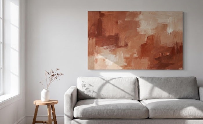
Walls are the most underused design real estate in most homes. We spend hours picking paint colors and throw pillows, then hang a single small frame dead center on a wall three times its size and wonder why the room still feels unfinished. That gap between “nice” and “designed” almost always comes down to proportion, not taste.
Oversized art has moved from trend piece to default choice for design-forward homeowners this year. But bigger doesn’t mean better if the scale is wrong. What follows isn’t another mood board. It’s a repeatable formula for choosing wall art sized correctly for your space, whether that’s a compact reading nook or a two-story entryway.
Why Scale Matters More Than Style
Most people blame color or subject matter when a piece of art looks “off” on a wall. Nine times out of ten, the real problem is proportion. A piece that’s too small floats in empty space and reads as an afterthought. One that’s too large crowds the furniture beneath it, making the whole wall feel cramped.
ElephantStock’s sizing guide lays out a starting ratio worth following: wall art should span roughly 60-75% of the width of the furniture it hangs above. For a standard six-foot sofa, that puts you in the 48-54 inch range for a single piece or a grouped arrangement. Go smaller than that, and the art loses its anchor. Go much bigger, and it can overwhelm a room with lower ceilings.
This is exactly where oversized art earns its reputation. A single statement piece sized correctly does more visual work than three or four small frames scattered across the same wall. If you’re staring at a blank wall above your sofa and want something that reads as intentional rather than accidental, browsing a collection of large wall decor built specifically for that kind of scale gives you a sense of what proper proportion actually looks like before you start measuring.
The Measuring Method: Getting Proportions Right
Skip the guesswork. Here’s the actual process interior stylists use before they ever click “buy.”
First, measure the width and height of the wall section you’re working with, not the entire wall, just the section above or beside the furniture piece you’re anchoring to. Second, measure the furniture below it, whether that’s a sofa, console, headboard, or buffet. Third, apply the 60-75% ratio to that furniture width to get your target art width.
Don’t skip the vertical math either. Leave 6 to 12 inches of clearance between the top of the furniture and the bottom edge of the artwork. Then hang the piece so its center is between 57 and 60 inches above the floor, which approximates average eye level according to the sizing methodology outlined in ElephantStock’s wall art size guide. That single number fixes more crooked-looking galleries than any amount of eyeballing ever will.
One more thing worth taking seriously: oversized pieces are heavier than they look, especially framed canvases or pieces mounted on wood panels. The U.S. Consumer Product Safety Commission publishes guidelines for securely mounting wall-hung decor, and it’s worth a five-minute read before you drill into drywall with a piece that weighs more than a typical framed print.
Matching Scale to Room Type
The 60-75% rule is a starting point, not a rigid law. It flexes depending on where you’re hanging the piece.
In a living room, the sofa or media console usually sets the scale. Above a headboard in a bedroom, use the bed’s width rather than the nightstands. In a dining room, a buffet or the table itself provides the reference measurement, and horizontal pieces tend to work better there since dining rooms are often wider than they are tall. Entryways are the exception to almost every rule: with no furniture to reference, you can size the piece to the wall itself, which is part of why entryways handle genuinely oversized art so well.
Ceiling height changes the math too. A vertical, elongated piece draws the eye upward and makes a tall room feel intentional rather than cavernous. A wide horizontal piece works better on long, low walls where a vertical piece would look stranded. If you’re refreshing a living room on a budget and want more room-specific combinations, our budget-friendly living room refresh guide breaks down several of these pairings in more detail.
Single Statement Piece vs. Gallery Wall
This is the decision that trips up most people once the measuring is done. Do you commit to one large piece or build a gallery wall from several smaller ones?
A single statement piece is the simpler choice, and it’s forgiving of small measurement errors since there’s only one element to get right. It also reads as calm and confident, which is part of why it suits minimalist and contemporary rooms so well. A gallery wall, on the other hand, lets you tell a story through a mix of photos, prints, and mementos, and it’s more flexible if your taste changes over time since you can swap pieces individually.
Design commentary heading into this year, including coverage from outlets like Architectural Digest and Elle Decor alongside Pinterest’s annual trend predictions, points toward homeowners moving away from multi-frame galleries in favor of a single oversized piece per wall. That’s not a rejection of gallery walls entirely, more a reflection of a broader move toward minimalism and curated, deliberate rooms rather than cluttered ones. If you’d rather go the gallery route, our piece on building a gallery wall walks through spacing and layout basics.
Why the Oversized Art Trend Is Accelerating
The move toward bigger, fewer pieces isn’t just an aesthetic preference. It’s backed by real market movement. The global wall art market was valued at approximately $66.89 billion in 2025 and is projected to grow at an 8.55% compound annual rate through 2032, according to data compiled by Magnetic Art. In the US specifically, the wall decor market is projected to grow by $12.6 billion between 2024 and 2029, driven largely by demand for premium and personalized pieces rather than mass-produced prints.
Part of that growth reflects something the National Endowment for the Arts has tracked for years: interest in art as part of everyday domestic life continues to climb, not just in galleries and museums but inside ordinary homes. People aren’t just buying art anymore; they’re treating their walls as a place to invest, the same way they’d invest in a good sofa or a well-made rug. For more ideas on tying a statement piece into an overall room concept, our guide to styling a modern living room covers how art fits alongside furniture and lighting choices.
Common Sizing Mistakes to Avoid
The most common is hanging art that’s simply too small for the wall, leaving it floating in a sea of empty space with no visual anchor. Close behind is ignoring ceiling height entirely and choosing a horizontal piece for a tall, narrow wall where a vertical piece would work far better. Overcrowding a small room with an oversized piece is another frequent misstep, one that makes a modest space feel smaller rather than more curated. And finally, mismatching the art’s palette to the room’s natural light can throw off the whole effect, since a piece that looks rich and warm under gallery lighting can look muddy in a north-facing room.
None of these mistakes are expensive to fix once you know to look for them. Most come down to skipping the measuring step and buying on impulse.
Getting It Right
Proportion is a formula, not a guess. Measure the wall, measure the furniture, apply the ratio, and let the numbers guide the decision rather than instinct alone. Once you’ve got the dimensions sorted, choosing between a single statement piece and a gallery wall becomes a much easier call, because you already know what will actually fit.
The homes that feel the most put together aren’t the ones with the most expensive art. They’re the ones where every piece is sized as if it were made for that exact wall. Measure first, then shop. The styling takes care of itself after that.